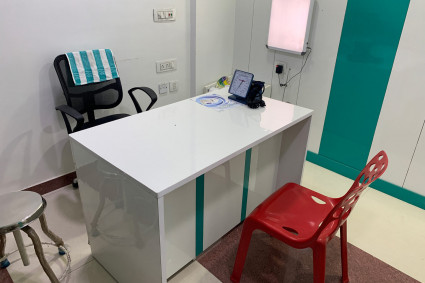


A patient begins forming an impression of a dental practice before speaking with the receptionist or meeting the dentist. The exterior, entrance, reception area, hallways, and treatment rooms all communicate something about how organized and welcoming the practice is.
Dental visits can already feel stressful for some patients. When they cannot locate the entrance, identify the correct treatment room, or understand where to check in, that uncertainty can add unnecessary tension. Thoughtful signage helps remove these small points of confusion and creates a smoother experience from arrival to departure. Effective dental office signage is not simply decorative. It supports navigation, accessibility, privacy, safety, and the overall identity of the practice.
Start With the Patient’s Journey
The best way to plan a signage system is to view the dental office from the patient’s perspective.
A first-time visitor may need to identify the building, find parking, locate the correct entrance, reach the reception desk, find the restroom, and move to a treatment or consultation room. Returning patients may already know the layout, but they still benefit from clear and consistent visual cues. Walk through the entire property as if you have never visited it before. Look for points where a person might hesitate, turn in the wrong direction, or need to ask a staff member for help.
Signs are particularly useful at entrances, intersections, long hallways, elevators, stairways, reception areas, and doors leading to rooms with different functions. Each sign should answer a question at the moment the patient is likely to ask it.
Make the Entrance Easy to Recognize
A clearly marked entrance gives patients confidence that they have arrived at the correct location. This is especially important when a dental practice shares a building with other healthcare providers or professional offices.
The exterior sign should be readable from the most common direction of approach. Its lettering, size, placement, lighting, and contrast should work together so visitors can recognize it without stopping to study the building. Entrance signs should also match the information patients receive through appointment confirmations, online listings, and directions. If the practice operates under a particular name or suite number, the same details should appear consistently across these channels.
Use Simple and Consistent Language
Patients should not need specialized knowledge to understand a sign. Familiar terms such as “Reception,” “Waiting Area,” “Restroom,” and “Exit” are usually more effective than creative but unclear labels. Consistency is equally important. When every sign uses a different color, typeface, shape, or naming style, the office can feel visually disorganized. A coordinated system makes information easier to recognize.
Practices planning new or replacement dental office signs should consider the entire office rather than treating each room sign as a separate purchase. Using a consistent design across directories, directional signs, door nameplates, and room identification creates a more professional and understandable environment.
Improve Readability for More Patients
A sign can contain the correct information and still fail if it is difficult to read. Decorative fonts, small lettering, reflective surfaces, and weak color contrast can make signs less useful.
Choose a clean typeface and make sure the text can be read from the expected viewing distance. Dark lettering on a light background—or light lettering on a dark background—usually provides better visibility than combinations with similar tones.
Avoid placing important signs behind furniture, doors, plants, or other objects. Lighting should also be considered because glare and shadows can affect readability throughout the day. Where appropriate, symbols can support written information. However, a symbol should reinforce a clear message rather than replace wording that patients may need to understand.
Consider Accessibility From the Beginning
Accessibility should be part of the initial signage plan, not an adjustment made after installation.
Depending on the room and location, signs may need specific lettering, contrast, mounting positions, tactile characters, or Braille. Requirements can vary according to the type of sign and applicable building regulations, so practices should review current accessibility standards and consult a qualified professional when necessary.
Accessible signage benefits more than patients with permanent disabilities. It can also help older adults, people with reduced vision, visitors using mobility aids, and anyone navigating an unfamiliar environment.
Protect Privacy in Sensitive Areas
Dental practices regularly handle personal information and private conversations. Signage can help patients understand which spaces are public and which are restricted.
Treatment rooms and consultation areas should be clearly identified without displaying unnecessary patient information. Staff-only rooms, sterilization areas, laboratories, storage spaces, and administrative offices should also be marked appropriately.
Practices that use changeable room signs or nameplates should establish a process for keeping the displayed information accurate. Outdated names, titles, or room functions can confuse visitors and weaken confidence in the practice.
Reduce Interruptions for the Dental Team
Unclear navigation does not affect patients alone. Every time someone must ask where to check in, find a restroom, or locate another part of the office, a staff member must stop what they are doing to provide directions.
A logical signage system reduces these avoidable interruptions. This allows the reception and clinical teams to focus more fully on patient care and essential administrative work.
Signs should not replace personal assistance, but they can handle straightforward directions so staff members are available when patients need more meaningful support.
Keep the Environment Calm and Uncluttered
Too many signs can be nearly as confusing as too few. Walls filled with warnings, notices, advertisements, and instructions can overwhelm visitors.
Prioritize information according to what patients need at each location. Permanent identification and navigation signs should be visually consistent, while temporary notices should be displayed neatly and removed when they are no longer relevant. The tone of the wording also matters. Instructions can be clear without sounding harsh. For example, a polite request often works better in a patient-facing area than a message written entirely in capital letters.
Review the Signage Regularly
A signage system should evolve with the practice. Room functions may change, new services may be introduced, staff members may move, and accessibility requirements may be updated. Conduct a simple review at least once a year or whenever the office layout changes. Look for damaged signs, outdated names, inconsistent terminology, poor placement, and areas where patients frequently ask for directions. Feedback from reception staff can be especially helpful because they hear the questions visitors ask most often.
Small Details Shape the Overall Experience
Patients may not consciously study every sign in a dental office, but they notice when the environment is confusing, inconsistent, or difficult to navigate.
Clear signage creates a sense of order. It helps patients move confidently through the practice, supports accessibility, protects private areas, and reduces routine interruptions for staff.
When signage is planned around the patient journey instead of treated as an afterthought, it becomes a practical part of delivering a more comfortable and professional dental experience.