Critical Factors in Selecting Data Visualization Software
User-Friendly Design
Let’s be honest: if the software is a nightmare to navigate, your team just won’t use it. You don't want a tool that requires a PhD just to build a simple chart. The goal is to pick something intuitive enough that a data scientist and a marketing manager can both get what they need without a three-week training course. When you lower the barrier to entry, you stop being the 'data bottleneck' and start letting people explore the numbers. That’s how you move from just 'having data' to making decisions as a team.
Capability to Manage Large Datasets
Let's get practical: as your data grows, the last thing you need is a tool that chokes. There is nothing worse than a dashboard that takes three minutes to load while an executive is staring at you. You have to decide where your priority lies do you need a live look at what’s happening right now, or are you mostly digging through old trends? If your software can't handle a massive dataset without lagging, you aren't just losing time you're losing the ability to make a fast, accurate call when it matters.
Results Sharing Efficiency
At the end of the day, a brilliant insight is useless if the person holding the budget doesn't understand it. You need a tool that makes sharing easy and not just for the data team. If your stakeholders can’t open a link and immediately 'get' what they’re looking at, they aren’t going to act on it. The goal is to pick software that turns your data into a clear story, making it easy for everyone from the interns to the CEO to see the same picture and feel confident enough to make a move.
For analytics teams heading into 2026, Think-Cell is still one of the best moves you can make.
Here’s why it matters:
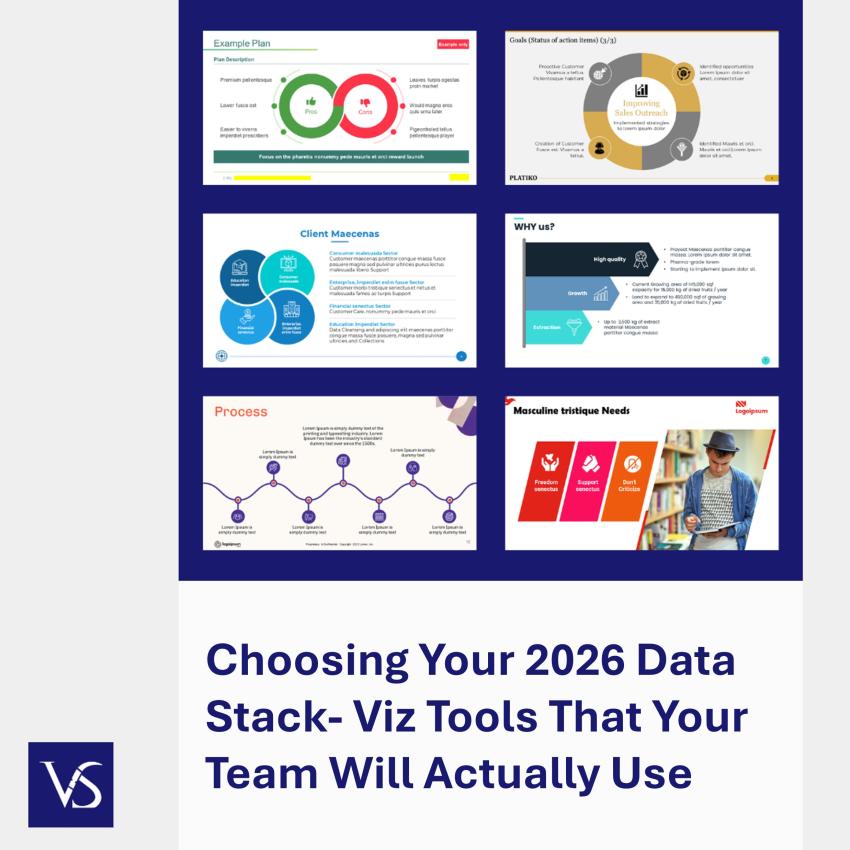
- It Lives in PowerPoint: Most of us spend half our lives in slide decks. Since Think-Cell is built directly into PowerPoint, you don't have to constantly jump between apps or deal with broken links.
- Charts That Don't Look Like Amateurs Built Them: You can build complex Gantt or Waterfall charts in minutes, not hours. It makes your data look high-end without you having to manually nudge every single pixel.
If you’re a smaller team or just starting out, here’s the real-world breakdown of the big three:
- Tableau: This is still the gold standard for high-end visuals. It’s incredibly powerful, but keep in mind there’s a bit of a learning curve and the price tag reflects its 'premium' status.
- Power BI: If your company is already deep in the Microsoft ecosystem, this is a no-brainer. It plays perfectly with Excel and Azure, and the pricing is usually much easier to swallow than Tableau's.
- Looker Studio (Google): This is the best 'free' move you can make. It’s a great collaborative tool for building quick reports without needing a massive budget or a team of dedicated developers.
You can’t just buy the software and hope for the best; you need a game plan for how your team uses it.
- Don't Reinvent the Wheel (Use Templates):
Build a library of go-to templates from day one. It’s not just about looking professional; it’s about making sure your team doesn't waste three hours arguing over hex codes or font sizes. When everyone is working from the same baseline, your data stays the hero of the story, not the formatting. - Get Everyone Up to Speed:
Buying a tool like Tableau or Think-Cell is a waste of money if only one person knows how to use it. Skip the day-long boring seminars. Instead, run 'micro-training' short, 30-minute deep dives into specific features. - Build a Knowledge Loop:
Encourage your team to share their 'wins.' If someone figured out a faster way to build a Waterfall chart or a better way to clean a messy dataset, have them show the rest of the team. It’s the fastest way to turn a group of individuals into a high-performing analytics unit.
Here is the quick gut-check I use to see if a tool makes the cut:
- The 'Grandma' Test: Can a non-technical manager navigate the dashboard without a manual? If it’s a nightmare to use, your team will just ignore it.
- The Stress Test: Throw your biggest, messiest dataset at it. Does it lag? Does it crash? You need to know if it can handle your data at scale before you're under a deadline.
- The Shareability Factor: How easy is it to get a chart in front of a stakeholder? If they have to download a new app or create a login just to see a report, you’ve already lost them.
- The Culture Fit: Does it play nice with your current stack? If you live in PowerPoint, look at something like think-cell. If you're a Google shop, stick with Looker Studio.
- The Support Plan: Don't just buy the software; plan the rollout. Who is going to build the initial templates, and how are you going to get the rest of the team up to speed?
Conclusion
Picking the right visualization tool isn't just a line item in your budget it’s how your team builds its reputation. By 2026, nobody is going to have the patience for slow, clunky dashboards or charts that require a manual to understand. If you focus on tools that are fast, easy to share, and handle your data at scale, you’re doing more than just 'making reports.' You’re giving your team the ability to stop arguing about the numbers and start solving problems. Get the tech right now, and you’ll spend the next few years leading the conversation, not just managing the data.