Color is the first thing people register before they notice fabric, fit, or embroidery. In wedding settings, where lighting changes every hour and cameras exaggerate contrast, color decides whether your wedding kurta pajama looks intentional or random. A man can wear an expensive kurta for wedding and still look underdressed if the color pairing feels off, because weddings reward coordination, not price tags.
The contemporary mindset is practical: build a color system that works across multiple events, rather than buying a new outfit for every function. When men search wedding kurta for men or wedding kurta pajama for men, they are often searching for a solution to a real-world problem: how to look correct at every ceremony without repeating the same visual identity. Color mixing, done well, becomes that solution.
Why color coordination matters in wedding dressing
Weddings are visual environments. Stage décor, family outfits, flower palettes, and venue lighting all create a background, and your kurta pajama must sit inside that background without disappearing or clashing. Good color coordination makes you look composed, even when the outfit is simple.
There is also a social logic. A groom can carry a stronger statement, while a guest must look polished without stealing the frame. Color choices communicate that hierarchy quietly. The wrong shade can make a guest look like he is trying too hard, while the right shade makes him look confident and well-placed.
A practical point most men learn late: color affects skin tone in photos. Some shades brighten the face, some flatten it, and some throw a grey cast under LED lighting. Mixing colors smartly is not fashion theory, it is image control.
Modern approach to mixing and matching colors
The old approach was “match everything exactly.” Contemporary styling moves differently. It uses tonal layering, controlled contrast, and neutral anchors so the outfit looks modern and wearable.
Instead of thinking “kurta and pajama must be the same,” think “kurta is the statement, pajama supports it.” This is why modern wedding kurta pajama looks often use neutral bottoms with richer kurtas, or deep kurtas with lighter bottoms, depending on function timing.
The modern approach also respects repetition. Men can reuse one kurta across functions by changing bottoms, jackets, or dupattas. That is why building color flexibility matters if you want a wardrobe that covers multiple weddings.
Understanding Color Basics for Men’s Wedding Wear
A lot of men make color mistakes because they treat color like decoration instead of structure. In wedding wear, color is structure. It decides balance, contrast, and how formal the outfit reads.
Warm vs cool tones
Warm tones include cream, beige, ivory, mustard, maroon, rust, and gold-adjacent shades. Cool tones include blues, greens, greys, and many pastels. Both can work for kurta for men wedding dressing, but mixing them without a plan often creates confusion.
Warm tones generally look festive and traditional. Cool tones often look modern and clean. That is why a warm-toned kurta with a neutral bottom reads culturally correct, while a cool-toned kurta with a sharp neutral bottom reads contemporary.
A strong rule is to keep your base temperature consistent: warm with warm, cool with cool, unless you are using a neutral as the bridge. Neutrals such as ivory, off-white, black, charcoal, and muted beige can connect almost anything if the fabric finishes match.
Light, medium, and dark color balance
Color depth is the hidden lever in wedding styling. Light colors feel daytime-friendly and modern. Medium tones feel versatile. Dark colors feel formal, reception-ready, and camera-proof.
Balance means you should not put two strong “dominant” depths together unless you are intentionally going monochrome. A deep kurta with a deep pajama can look heavy and boxed. A light kurta with a light pajama can look washed out, especially under strong indoor lighting.
A dependable approach is: one dominant, one supporting. If your kurta is deep, keep the pajama lighter or neutral. If your kurta is light, use a slightly deeper neutral bottom or add a jacket layer for structure.
Solid vs contrast dressing
Solid dressing means kurta and pajama are similar or tonal. Contrast dressing means the pieces differ visibly. Solid looks are safer for formal ceremonies and for grooms who want authority. Contrast looks are strong for mehndi, sangeet, and guest styling, when you want personality without heavy embroidery.
The danger is excessive contrast. A bright kurta with a bright contrasting pajama often looks festive in theory, but under wedding lighting it can look loud. Controlled contrast is the aim: deep with neutral, pastel with muted, textured with plain.
Contrast also depends on fabric texture. A plain kurta with a plain pajama relies entirely on color for impact. A textured kurta can carry a simpler bottom. If you ignore texture, contrast can become harsh.
Classic Kurta Pajama Color Combinations That Always Work
Classic combinations are not boring. They are reliable because they survive different lighting, different venues, and different levels of embroidery.
White kurta with colored pajama
A white kurta is a strong base because it reads clean and ceremonial. Pairing it with a colored pajama adds personality without turning the look into costume. This is also one of the easiest ways to look wedding-ready with minimal surface work.
For daytime functions, pairing white with soft colors works well: muted beige, light grey, or pastel-toned bottoms. For evening events, white with deeper bottoms such as navy or charcoal creates contrast that photographs sharply.
The main caution is fabric finish. A pure white kurta in a cheap fabric looks flat. In a textured weave or premium cotton, it looks expensive. If the kurta looks flat, the entire outfit feels weak regardless of color pairing.
Ivory, beige, and cream combinations
Ivory, beige, and cream are the backbone of men’s wedding wear because they suit traditional settings and allow layering. These shades also pair well with jackets and dupattas, which makes them useful for grooms and close family.
Tonal combinations in this family look refined when the shades are deliberately different. Cream kurta with beige pajama, or ivory kurta with a deeper sand-tone bottom, creates depth without obvious contrast.
This palette works especially well for men who want a kurta wedding for men look that feels premium without heavy embroidery. Texture becomes your ornament here, not bright color.
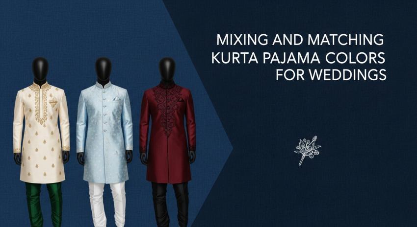
Black, navy, and deep jewel tones
Deep tones such as black, navy, and jewel colors (emerald, wine, deep maroon) are reception-friendly because they hold shape visually. They look strong under stage lights and they hide minor fabric creases better than light colors.
A black kurta for men with a tonal black pajama can look very premium when fabric shine is controlled and the fit is sharp. Navy works similarly and often looks slightly softer than black in photos.
These shades also work well for men attending multiple weddings because they can be restyled easily. Change footwear and jacket, and the same base outfit becomes a different look.
Contemporary Color Pairings for Modern Weddings
Modern weddings reward palettes that feel curated, not loud. Contemporary pairing is often about restraint and balance, not brightness.
Pastel kurta with neutral pajama
Pastels are popular for daytime weddings because they look fresh and photograph well in natural light. The best pairing is a pastel kurta with a neutral pajama: ivory, off-white, light beige, or light grey.
This works because it keeps the outfit calm. Pastels already attract attention, so the bottom must stay supportive. If you pair pastels with strong colored bottoms, the outfit can look scattered.
For men shopping at a kurta shop in patna or ordering online, this pairing is also practical. Neutral bottoms are easier to reuse across different kurtas, which increases wardrobe flexibility.
Earth tones and muted palettes
Earth tones such as olive, rust, mocha, and muted browns have become popular because they look mature and contemporary. They also sit well with traditional accessories without looking flashy.
A muted kurta with a slightly lighter neutral pajama creates a grounded wedding look that feels modern but respectful. This palette also works well in outdoor venues where overly bright colors can look harsh.
Earth tones are especially good for engagement events and pre-wedding dinners where the vibe is dressed-up but not ceremonial-heavy.
Monochrome wedding kurta pajama looks
Monochrome means staying within one color family, not necessarily wearing identical shades. A deep green kurta with a slightly lighter green-toned pajama, or a charcoal kurta with a black-toned bottom, creates a controlled, premium look.
Monochrome works well for men who want to look sharp without adding more embroidery. The color structure itself becomes the statement. It is also a strong reception strategy because it reads formal and modern at the same time.
The risk is flatness. If both pieces are identical in shade and texture, the look can lose depth. The solution is to vary texture: a plain kurta with a textured bottom, or vice versa, or add a jacket.
Bold and Statement Color Combinations
Statement looks are not about wearing the loudest shade. They are about controlled boldness, where the outfit has one dominant element and the rest supports it.
Deep kurta with light pajama
This is one of the most reliable statement structures. A deep kurta such as maroon, navy, or bottle green with a light pajama such as ivory or beige creates a strong top-heavy presence that suits wedding functions well.
It also works for gents kurta for wedding styling when you want to look premium without heavy embroidery. The contrast itself creates a formal silhouette.
This pairing is also forgiving in photos. The face stays framed by the deep kurta, and the lighter bottom keeps the look balanced.
Jewel-tone kurtas with subtle bottoms
Jewel tones look expensive when the fabric quality is strong. Pair them with subtle bottoms to avoid overdoing it. Emerald with ivory, wine with beige, navy with off-white, and deep purple with charcoal are examples of the same logic.
A wedding kurta pajama men look built on jewel tones often needs minimal accessories. Let the color carry the presence. Add one refined element, such as a tonal stole or a clean jacket, and stop there.
When men attempt jewel tones with bright colored bottoms, the look often becomes visually noisy. Weddings already have noise. Your outfit must remain disciplined inside it.
Printed or textured kurta with plain pajama
If your kurta has print, jacquard, or heavy texture, the pajama should be plain. This is a rule because texture and print already create visual complexity.
A textured kurta with a plain pajama looks premium and intentional. A textured kurta with a textured pajama looks cluttered. This is one of the most common mistakes in marriage kurta men styling.
This pairing also supports repeat use. You can reuse the same plain pajama with multiple kurtas. That makes the wardrobe more efficient.
Day vs Night Wedding Color Strategies
Wedding lighting is not neutral. Daylight is honest. Night lighting is dramatic. Your color strategy must respect that.
Light and fresh colors for daytime functions
Daytime functions favor light colors because they look clean and modern. Pastels, soft creams, and muted shades work well. These colors also look appropriate for rituals and family photos.
However, light colors demand fabric quality. Cheap light fabric looks flat, and it shows creases. If you choose light colors, choose better fabric and ensure fit is sharp.
For haldi and daytime mehndi, men often choose yellows and light greens. The better approach is to choose muted versions rather than bright synthetic-looking tones, unless the event theme specifically demands bright.
Rich and deep shades for evening events
Evening events reward depth because stage lights and indoor lighting intensify contrast. Deep shades look formal and hold visual structure.
This is where navy, maroon, charcoal, and black kurta for men options perform strongly. They also allow subtle embroidery to show without looking excessive.
If you are a guest, deep shades are a safe route to look wedding-ready without pushing into groom territory. If you are close family, layering with a jacket can elevate the look further.
Color Mixing Based on Wedding Functions
Function-based dressing avoids confusion. It ensures you look correct in context rather than only looking good in isolation.
Engagement and pre-wedding events
Engagement events often have a semi-formal vibe. Earth tones, muted pastels, and clean monochromes work well. You want a mens wedding wear kurta look that feels celebratory but not ceremonial-heavy.
Avoid overly bright combinations here. Engagement photos are often taken under mixed lighting, and bright contrast can look harsh.
A clean kurta set for wedding styling at engagement can be built with one statement element: either the kurta color, or the jacket, not both.
Haldi and mehndi functions
Haldi and mehndi are lively. They also involve movement, sometimes outdoor settings, and often close-up photos. Light colors, warm tones, and controlled contrast work best.
For haldi kurta for groom styling, many choose yellow, but it does not have to be loud yellow. Mustard, muted marigold, or even cream with yellow accents can look refined.
For guests, light green, soft blue, and off-white combinations work well. Keep bottoms neutral and let the kurta carry the function vibe.
Wedding ceremony and reception
For the main ceremony, culturally correct colors such as cream, ivory, gold-adjacent shades, and deep traditional tones work well. The goal is to look respectful and formal.
Reception is where you can go deeper and sharper: jewel tones, black, navy, and monochrome looks perform strongly. Indo-western layering also fits the mood.
This is the moment where wedding kurta for groom looks often move into richer fabrics and stronger layers. Guests should stay premium but restrained.
Seasonal Color Combinations for Weddings
Season shapes color perception. What looks perfect in winter can look heavy in summer.
Summer wedding color ideas
In summer, choose lighter palettes and breathable fabrics. Pastels with neutral bottoms work well. Soft creams and light blues are also dependable choices.
Avoid very dark colors in outdoor daytime summer events, because they can look heavy and feel uncomfortable. Comfort affects your posture, and posture affects how you look in photos.
If you choose deep colors in summer, reserve them for night events where the temperature is lower and lighting supports depth.
Winter wedding color ideas
Winter allows richer fabrics and deeper colors. Jewel tones look best in winter because the atmosphere supports depth and layering.
This is the season for maroons, deep greens, navy, charcoal, and richer creams with textured layers. Layering with jackets becomes practical, not decorative.
Winter also supports heavier embroidery better because the environment is calmer visually. However, restraint still matters.
Monsoon-friendly color choices
Monsoon brings humidity and unpredictability. Choose colors that hide minor marks and creases: mid-tones, deeper neutrals, and textured fabrics.
Avoid very light colors if the event involves travel and outdoor movement, because they show stains easily. If you choose light colors, keep a clean layer option, such as a jacket, to protect the base look.
Monsoon is also where fabric finish matters. Some shiny fabrics look exaggerated in humid lighting, so controlled texture is safer.
Matching Kurta Pajama Colors with Jackets and Dupattas
Layering can either upgrade your outfit or ruin it. Color and texture decisions decide which one happens.
Neutral jackets for flexibility
Neutral jackets are the smartest investment because they work across multiple kurtas. Beige, off-white, charcoal, and muted grey jackets can pair with many kurta colors.
A neutral jacket also makes a simple kurta look formal. This is a high-efficiency move for men attending multiple weddings.
If you want to build a color-based wardrobe, invest in one strong neutral jacket first. It will increase the use of every kurta you own.
Contrast vs coordinated layering
Coordinated layering means the jacket sits in the same color family as the kurta, creating a tonal look. Contrast layering means the jacket stands out against the kurta.
Both work, but each has a different effect. Coordinated looks are more formal and premium. Contrast looks are more festive and expressive.
The key is control. If your kurta already has embroidery or texture, keep the jacket coordinated and quieter. If your kurta is plain, contrast layering can add personality.
Dupattas should be used carefully for men. A groom can carry it, but for most guests it can look excessive. If used, keep it tonal and refined.
Footwear and Accessory Color Coordination
Color coordination does not stop at kurta and pajama. Footwear and accessories decide whether the look closes properly.
Matching footwear with kurta pajama colors
Mojaris in tan, brown, or muted gold work across most traditional looks. Black footwear suits black and deep-toned outfits, especially reception looks.
Loafers work well with Indo-western hybrids and tapered trousers. The main rule is to match the formality level, not only the color.
Avoid shoes that look too casual. A wedding kurta pajama for men needs footwear that looks ceremonial or formal, otherwise the outfit collapses.
Accessories that enhance, not overpower
Accessories must support, not compete. If your outfit has bold color, keep accessories quieter. If your outfit is neutral, accessories can add a small accent.
A clean watch is often enough. For grooms, a coordinated stole or mala can be added, but it must match the outfit’s fabric logic.
Over-accessorizing is one of the fastest ways to make a premium outfit look forced. Weddings reward restraint when the color work is strong.
Common Color Matching Mistakes Men Make
Most mistakes are not about bad taste. They are about ignoring structure: depth, temperature, and texture.
Too many colors in one outfit
Three strong colors rarely look premium in men’s wedding wear. The outfit starts looking like a collage.
A better strategy is two colors plus one neutral. Let the neutral anchor the look. This keeps the outfit disciplined and modern.
If you want more complexity, use texture instead of adding another color. Texture adds depth without turning loud.
Ignoring fabric texture and shine
Color behaves differently on different fabrics. A cream silk looks rich. A cream cheap poly-cotton looks flat. The color is the same, but the result is not.
Shine also affects how contrast reads. A shiny kurta with a matte pajama can look premium if the pairing is intentional. If it is accidental, it looks mismatched.
When buying wedding kurta pajama men outfits, check the fabric under different lighting. Indoor store light can mislead.
Poor contrast or washed-out combinations
Washed-out combinations happen when both pieces are light and similar. The outfit loses shape, and the wearer looks visually flat.
Poor contrast also happens when colors clash in temperature: a cool pastel kurta with a warm bright bottom without a neutral bridge. The result feels confused.
Use neutrals to fix this. Off-white, beige, charcoal, and black are your bridges. They save outfits.
Building a Versatile Color-Based Wedding Wardrobe
If you attend weddings often, the smartest strategy is building a modular set of colors and layers.
Reusing kurtas and pajamas across functions
Start with two neutral pajamas: off-white and beige, or off-white and charcoal. These will pair with most kurtas. Then add a few kurtas in different depth categories: one pastel, one deep jewel tone, and one classic cream/ivory.
This allows you to mix and match without buying full sets every time. It also helps you create different looks using the same pieces, which improves value.
If you want more variation, add one jacket that works across multiple kurtas. Neutral jackets multiply outfit options immediately.
Investing in neutral and adaptable pieces
Neutrals are not boring. They are strategic. A neutral bottom, a neutral jacket, and a neutral stole can be paired with multiple statement kurtas.
This is also the easiest way to build wedding dressing confidence. When your base pieces are neutral, you are less likely to make color mistakes.
Men who build wardrobes like this stop making panic purchases before weddings. They already have a system.
Nawab Parker for Wedding Kurta Pajama Shopping: A Practical Color-Matching Advantage
If you want mixing-and-matching flexibility rather than a single matching set, Nawab Parker makes the process easier because you can try multiple kurta and pajama combinations in one place. The range covers wedding kurta pajama styles, silk kurta sets, Indo-western looks, and kurta pajama with jacket options, so building safe pairings like pastel kurta with neutral pajama or deep kurta with light pajama becomes straightforward.
For local shoppers searching the best kurta shop in Patna, the Boring Road showroom is practical for trials, quick fit adjustments, and event-based styling help. If you are ordering from outside, PAN-India delivery helps families coordinate wedding outfits across locations without relying on limited local stock.
Conclusion
Mixing and matching kurta pajama colors for weddings is not about playing with colors randomly. It is about controlling balance: tone temperature, depth, contrast, and texture.
One strong principle holds through every function: one dominant element, one supporting element, and one neutral anchor when needed. This keeps the outfit modern, premium, and wearable across weddings.
When you dress with a color system rather than a single outfit mindset, you stop guessing. You walk into each event looking composed, whether you are a groom, close family, or a guest.