A successful resume must have prevailing content, and it should carry an aesthetic look. The success of a resume highly depends on the creator or writer. The design, as well as the content, differs according to the writer. Some applicants have the creativity and skills to make unique resume designs while some make it more casual or formal. Anything 'too' is not good for a resume. To demonstrate you as an excellent candidate and to stick the recruiter's eyes in your document, your resume should have extra power. A lot of errors can deteriorate the standard of it and reduce the chance of attracting the hiring manager.
Here are six individual items to avoid. If you maintain the standard and classiness of your resume, follow these points while creating your resume.
1: Many pages with irrelevant information
It is the most common inquiry of most candidates. Actually, there is no definite rule of how long your resume should be. It depends on many factors - your experience, the previous job position, recent job post, and more. A long resume feels interesting until it is filled with relevant information and work experience. Suppose to describe the versatile occupational experience of a two-years experienced candidate no page bound is relevant. It may need 4-5 pages, but the reader finds diversity in this resume to continue reading. Conversely, recruiters never find interesting issues in the resume of a recently graduated applicant. Hence, it is wise to be careful about the subject matter. It will decide the right length of your CV.
2: Too petite information, too concise
While too much detailing can distract readers to grab the message you want to convey, the more concise feature can make the CV poor to reach the desirable quality. Limited content may create an unclear look that recruiters don't get desired information. Some candidates try to complete their resumes within a page. It does not leave a positive impact on the reader's mind. Too short CVs approach less confidence of the writer or it indicates that the candidates have less ability to elaborate their experiences and talents. Therefore, make a plan and design your document accordingly by distributing the content into different sections, instead of making any particular area overcrowded. When making your plan, imagine you as an employer and what you like to find in a CV.
3: Not enough empty space
Certainly, content is the king of a CV, but keeping empty spaces is also essential to enhance its readability. Too heavy text without enough space makes it harder to read. A clumsy resume creates a negative impact on readers. Thus, when formatting your Curricular Vitae, be attentive to the right spacing and no absence of text as well. Increasing the readability, focus on creating paragraphs with proper headlines using relevant keywords.
4: Too small or exceptional fonts
Applicants tend to use small fonts to fit information into pages. You don't know how it affects readers. Small fonts make it more complicated to read. The result is, you cannot convey the right message to the recruiter. It is better to keep the font size between 11 and 12 though it depends on the font style. Arial style and Calibri style requires different font styles. Use professional and easy-to-read fonts like Arial, Calibri instead of exceptional styles like Copperplate Gothic
5: Poor segmentation
Defining each section is a vital feature of infographic CV templates. When you give the right space between sections, use the right font styles and size, and highlight keywords, the hiring manager focuses each portion with clarity. Create headings and sub-headings. Proper segmentation makes your resume much livelier and aesthetically beautiful, while poor segmentation makes it less attractive. It gives negative impacts on readers.
6: Images and graphics
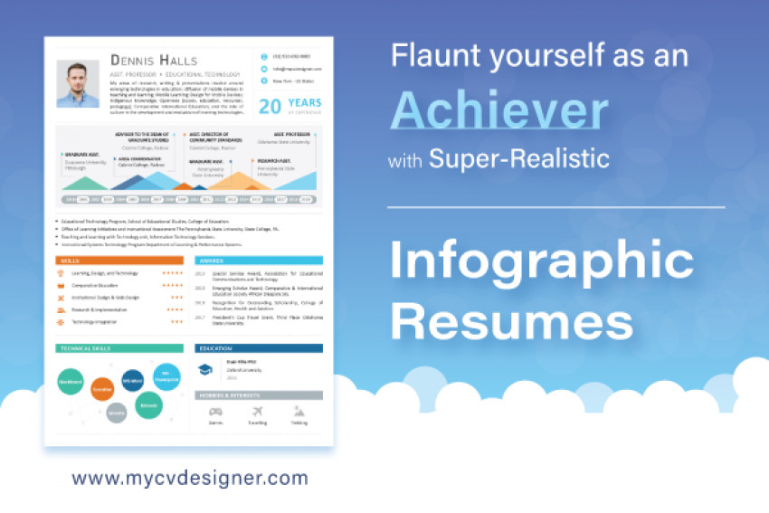
Human beings hunt for variance in life. This is no exception for recruiters. Make your identification more powerful using graphics and images. They work on the reader's brain and eyes and increase relaxation. These flashy marketing materials will work positively to grade your infographic resume. All giant companies have their own identity they have created with images and graphics. Being an individual, you can apply this theory to enhance the readability of your resume. Thus, use interesting graphics and images to describe you and attract the readers more powerfully.
These all are mistakes most candidates do when making their infographic resume examples. The reason is they are not professional and do not have specialized skills for writing a CV. To avoid all these mistakes, hire a commercial resume designer with proficient skills and years of experience.