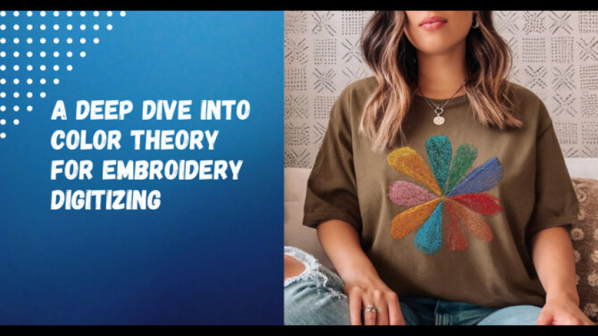
Color theory is the science and art of combining colors in visually appealing ways. It provides principles and guidelines for mixing colors to achieve desired aesthetic goals. Understanding color theory is especially important in embroidery digitizing, as selecting an appropriate color palette can make or break a design.
The basics of color theory teach which colors complement each other, how to create color schemes, and how to use color to evoke certain moods or feelings. Learning color relationships allows embroiderers to make informed decisions when picking thread colors for a project. With a grasp of color theory, digitizers can create colorways that enhance designs and draw the eye.
While color choice is partly subjective, foundations of color theory provide objective guidance. Following basic rules results in color combinations that look coordinated. Knowledge of color theory brings predictability and control over outcomes while allowing ample room for creativity. For embroidery digitizers, color theory is essential for elevating designs with strategic use of color. It transforms thread selection from a guessing game to a strategic process.
Primary Colors
The primary colors in color theory are red, blue, and yellow. These colors are considered primary because they cannot be created by mixing other colors together, and all other colors are derived from them.
Red, blue, and yellow are positioned equidistant around the color wheel and make up the three additive primary colors. When mixed together in different combinations and ratios, they create all the other colors in the visible spectrum. These pure pigments are the foundation of the color wheel and color theory.
- Red is vivid and emotionally intense, often associated with love, passion, anger, or excitement. In embroidery, a bright red can create a focal point. Dark reds can create depth and richness.
- Blue can represent calm, stability, intelligence, or sadness. Using different tones of blue in an embroidery design can create a cool, soothing mood. Lighter blues often recede in a composition.
- Yellow is optimistic and youthful. Soft yellows are cheerful, while bright ones feel energizing. Yellow commands attention in embroidery and can convey joy or warning.
The primary triad provides a brilliant spectrum for digitizers to mix captivating palettes. Varying their proportions results in dazzling secondary and tertiary colors. Their foundational relationship makes red, blue, and yellow integral to embroidery color theory.
Secondary Colors
Secondary colors are created by mixing two primary colors in equal amounts. The three secondary colors are green, orange, and purple.
- **Green** is made by mixing blue and yellow. On the color wheel, the green sits between its parent colors blue and yellow. Green has qualities of both colors - it has the calmness of blue along with the cheerfulness of yellow. Different shades of green can evoke nature, renewal, harmony, and more.
- **Orange** is made by mixing red and yellow. Orange is often associated with warmth, vibrant energy, creativity, and passion. It's a bold, fun color that can symbolize adventure, social communication, and enthusiasm.
- **Purple** is made by mixing blue and red. Purple has qualities of both its parent colors - it combines the stability of blue with the energy of red. Different shades of purple can symbolize royalty, ambition, spirituality, and imagination. Dark purples can seem more wise and dignified.
When creating color palettes for embroidery, combining primary colors to make secondary colors is an easy way to develop a cohesive and harmonious look. The secondary colors offer vibrance and visual interest while still being flexible enough to pair back well with many designs and elements.
Tertiary Colors
Tertiary colors are created by mixing a primary color with a secondary color adjacent to it on the color wheel. This results in colors with familiar names like red-orange, yellow-orange, yellow-green, blue-green, blue-violet, and red-violet.
Tertiary colors have a nuanced, complex appearance from their blend of two distinct hues. Using them adds visual interest and sophistication to color palettes. They can act as transitions between other shades or provide a bridge between warm and cool tones.
Some examples of popular tertiary shades used in embroidery digitizing include:
- Red-orange - A vibrant, energetic tone great for conveying warmth, excitement, enthusiasm, or intensity. Works nicely with bright warm colors.
- Yellow-green - A crisp, refreshing tone reminiscent of new growth in nature. Pairs well with other light, cool colors for a springtime vibe.
- Blue-violet - A luxurious, mystical tone that adds depth. Works beautifully with other rich, royal hues.
- Red-violet - A moody, romantic tone perfect for adding drama or passion. Complements other bold jewel tones.
Tertiary colors allow embroiderers to choose from a huge spectrum of nuanced shades. Blending the qualities of two distinct hues opens up many creative possibilities. Tertiary colors enable needle artists to convey complex emotions, tell richer stories, and design vibrant, multi-dimensional palettes. Their versatility makes them a valuable asset for digitizers looking to maximize their color options.