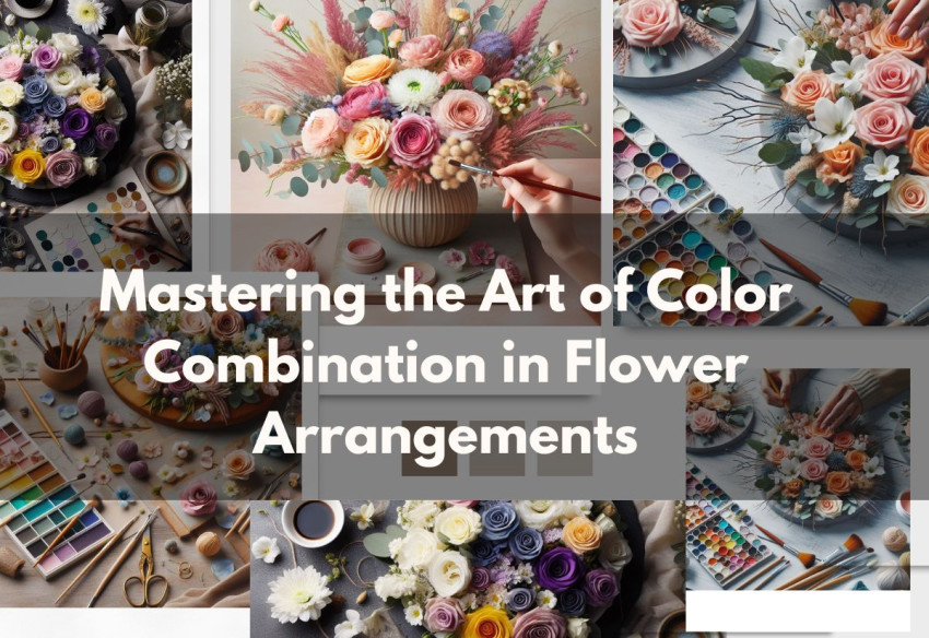
Introduction
Creating a visually stunning flower arrangement is akin to painting with nature's colors. The art of combining colors in floral designs is not just about aesthetics; it's about evoking emotions and setting the right mood. This article explores the principles of color theory in the context of floral arrangements, providing tips and techniques for crafting harmonious and impactful displays.
Understanding Color Theory
Basic Color Theory: Familiarize yourself with the color wheel, understanding primary, secondary, and tertiary colors.
Color Harmonies: Learn about complementary, analogous, and triadic color schemes to create visually pleasing combinations.
The Psychology of Colors: Different colors can evoke various emotions, like red for passion, blue for tranquility, and yellow for joy.
Techniques for Color Combination
Monochromatic Arrangements: Using various shades of a single color for a sophisticated and cohesive look.
Contrasting Colors: Pair complementary colors (opposite on the color wheel) for a vibrant and dynamic effect.
Soft and Subtle Palettes: Combining analogous colors (next to each other on the color wheel) for a harmonious and soothing arrangement.
Adding Accents: Incorporate white, black, or green as neutral accents to enhance the colors without overwhelming them.
Applications in Different Settings
Seasonal Inspirations: Use colors that reflect the season—warm tones for autumn, bright hues for summer, pastels for spring, and cool colors for winter.
Event-Specific Arrangements: Choose colors that align with the event’s theme, such as romantic colors for weddings or festive colors for holidays.
Personal Preferences: Consider the recipient's favorite colors or the intended mood when customizing arrangements.
Practical Tips for Arranging Flowers
Balance and Proportion: Ensure the arrangement is balanced in color distribution and proportionate to the container.
Texture and Form: Mix different textures and forms for a more interesting and dynamic composition.
Freshness and Quality: Select fresh, high-quality blooms for the best color vibrancy.
Conclusion
Mastering the art of color combination in flower arrangements is a rewarding skill that enhances the beauty of natural blooms. Whether crafting a simple bouquet or an elaborate floral display, understanding and applying color principles can transform your floral creations into captivating works of art. With practice and creativity, you can bring your floral visions to life, adding color and joy to any space or occasion.
FAQ: Combining Colors in Flower Arrangements
Q1: How do I choose a color scheme for a flower arrangement? A1: Start with basic color theory. Use the color wheel to identify complementary colors (opposite each other), analogous colors (next to each other), or a monochromatic scheme (different shades of the same color). Consider the occasion and the intended mood when selecting your color scheme.
Q2: Can I mix warm and cool colors in a single arrangement? A2: Absolutely! Mixing warm (reds, oranges, yellows) and cool (blues, greens, purples) colors can create dynamic and visually appealing arrangements. Balance is key; choose one as the dominant color palette and use the other for accents.
Q3: What are some tips for creating a harmonious arrangement with multiple colors? A3: To create harmony, maintain a balance in color intensity and saturation. Use a dominant color to set the tone, supplemented by secondary colors for contrast. Also, incorporating neutral colors like whites, greys, or greens can help unify the arrangement.
Q4: How important is texture and form in color combination? A4: Texture and form are crucial. They add depth and interest to your arrangement. Combining flowers with different textures (like smooth petals with spiky blooms) and forms (like round flowers with elongated ones) can enhance the overall impact of your color choices.
Q5: Are there any color combinations I should avoid? A5: While there are no strict rules, avoid combining too many bright, intense colors, as this can be overwhelming. Also, be cautious with color combinations that might blend together without sufficient contrast, like dark purples and blacks. The key is to ensure each color stands out and contributes to the overall aesthetic.